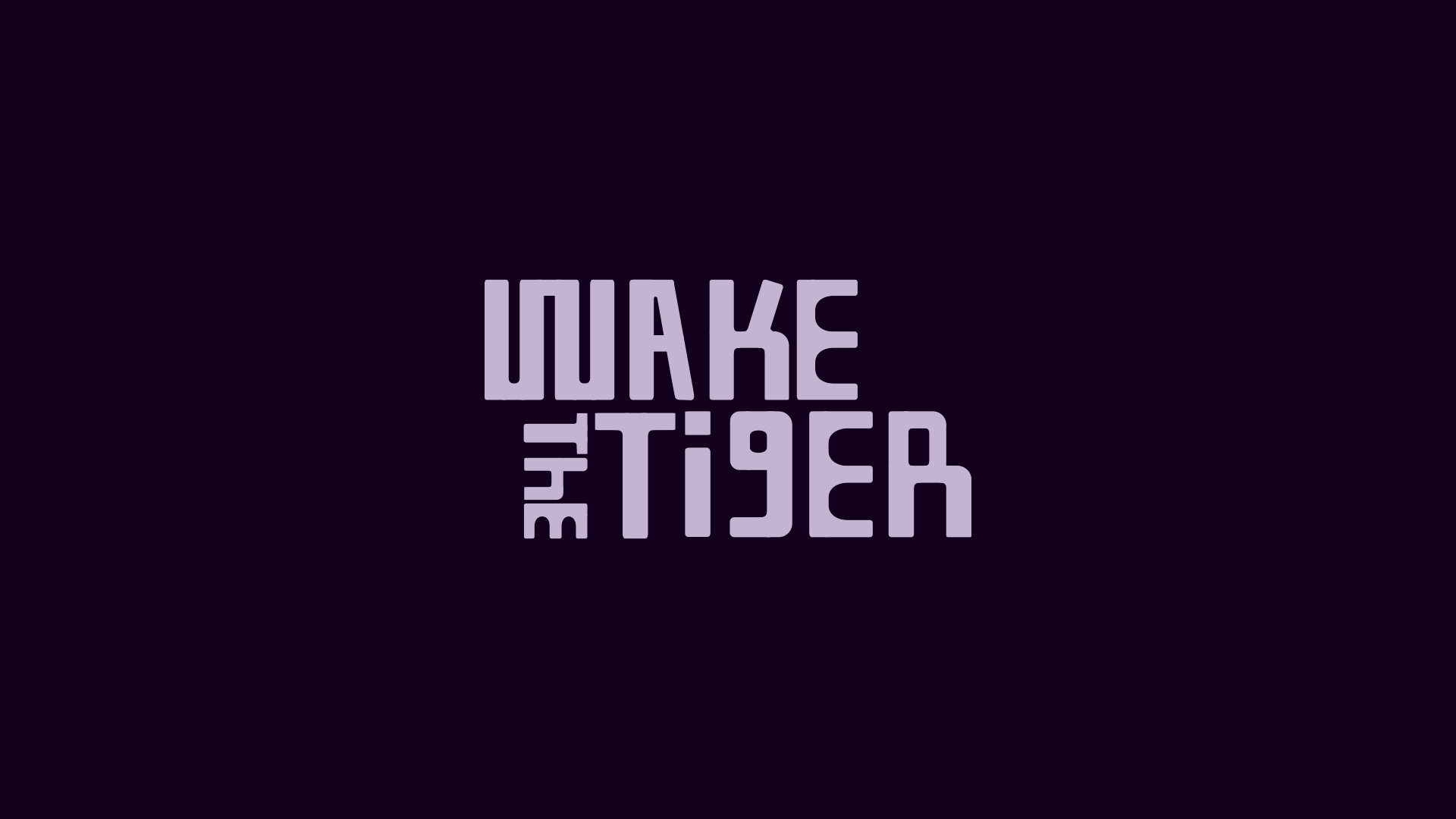
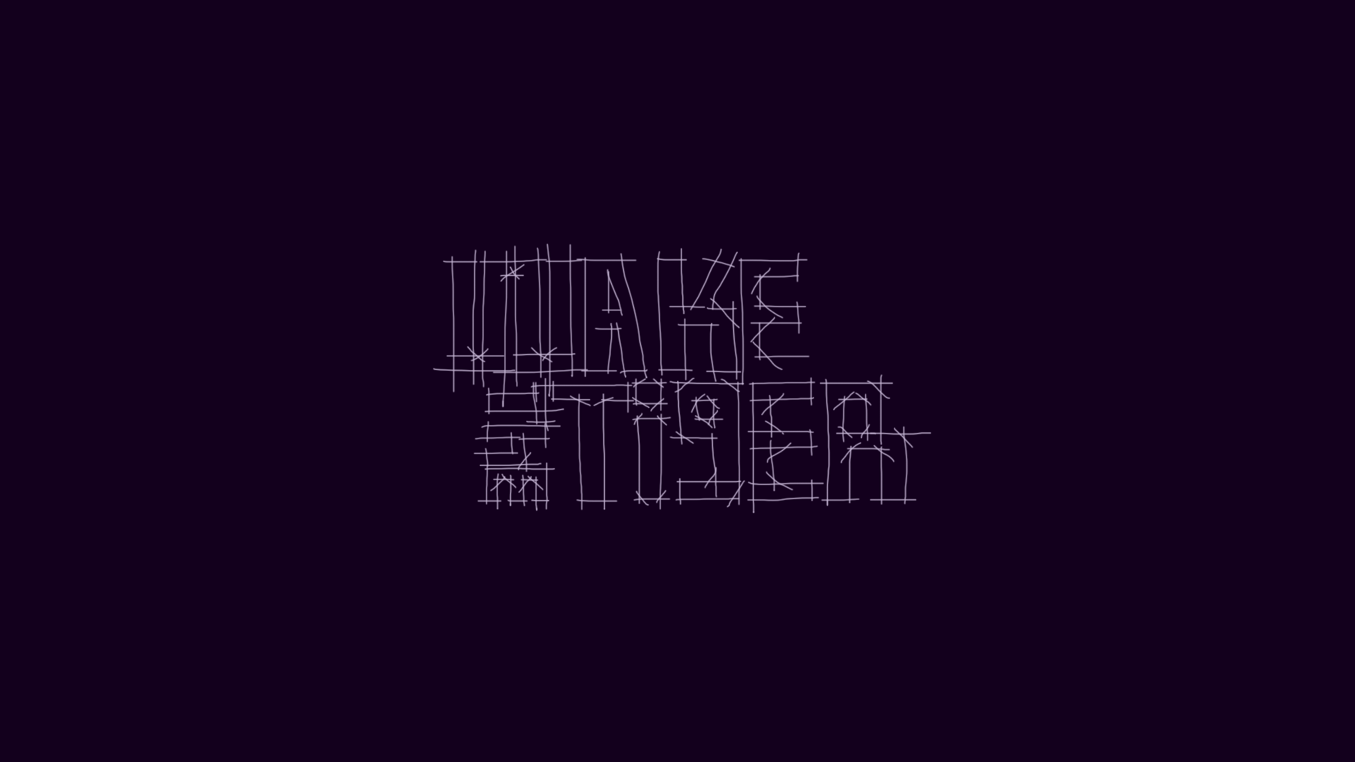
LOGO DESIGN
This identity focuses on the individuality of the letter forms. Using the nonuniformity of shape, weight, lack of balance, and cerning to create a distinctive look for the brand - representing the unique experience Wake The Tiger provides. The idea was to create a look that fits well, and also has a ageless design style that can be used for the future of the company - whilst creating a unique identity.
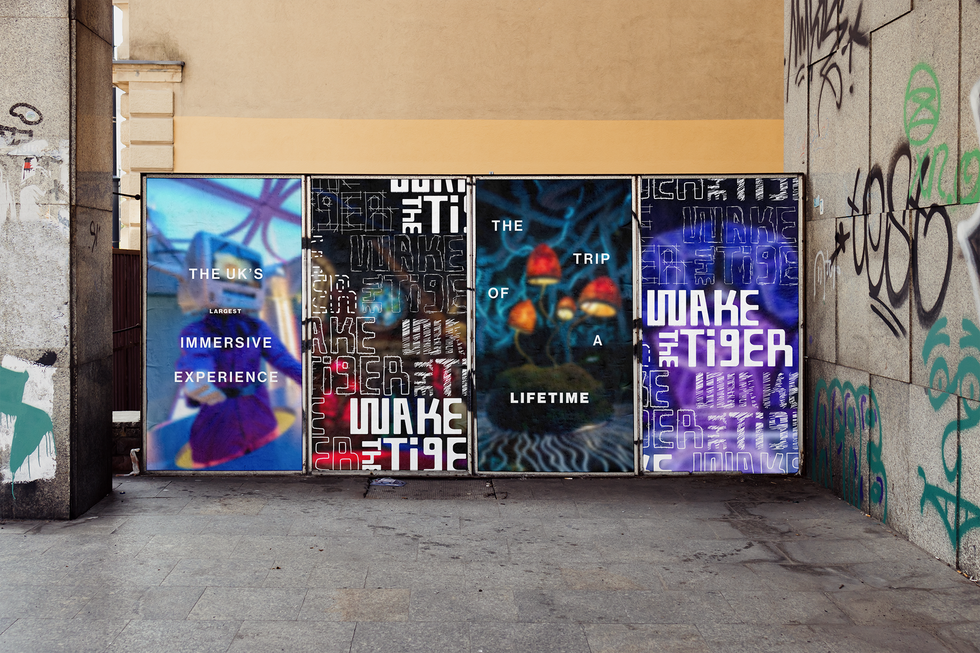
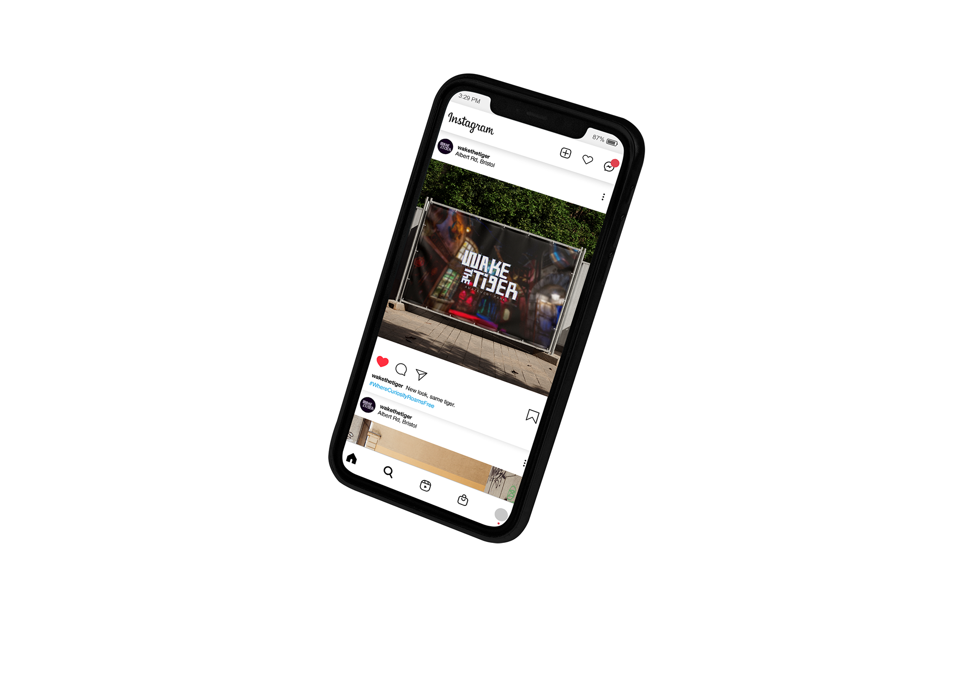
ADVERTISEMENTS
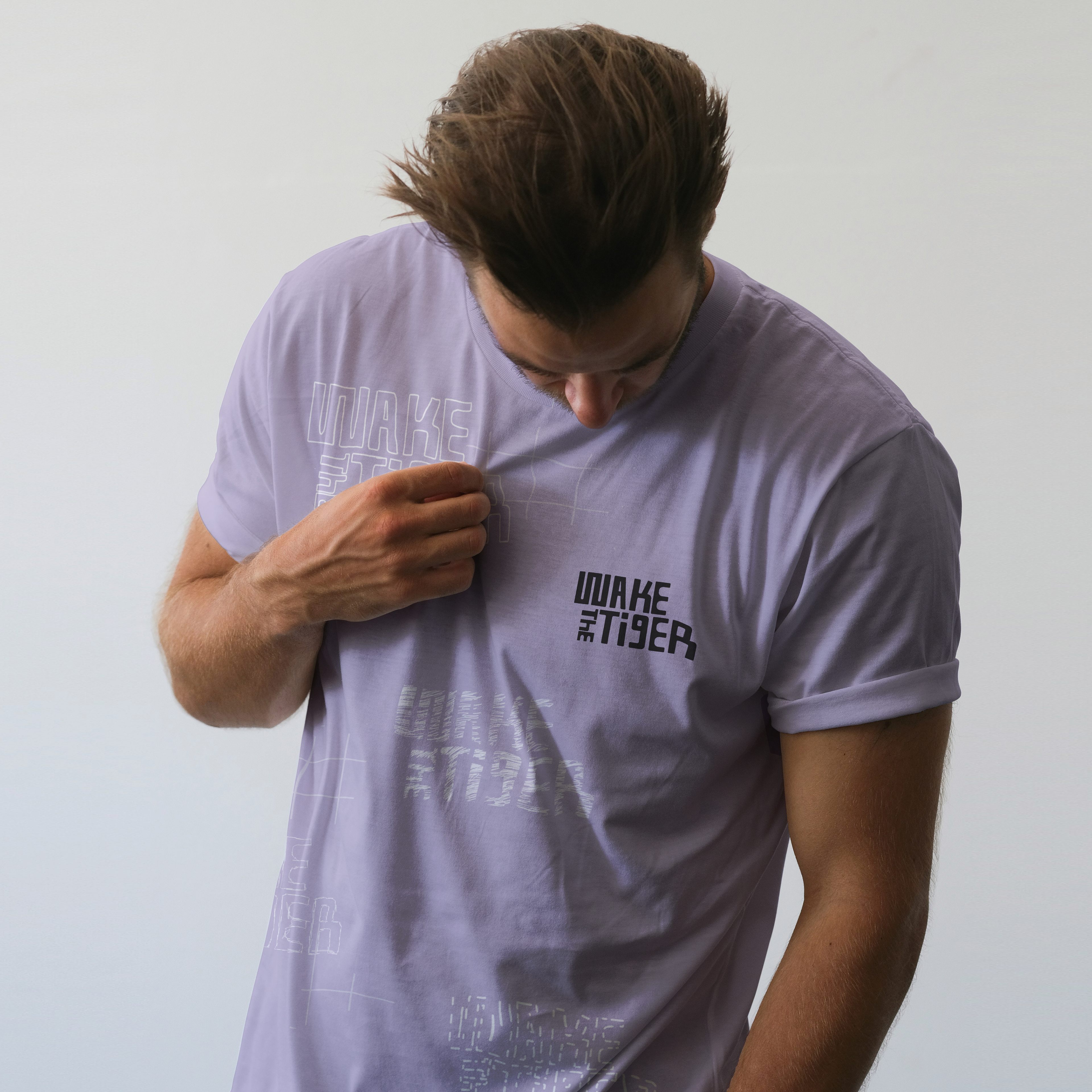
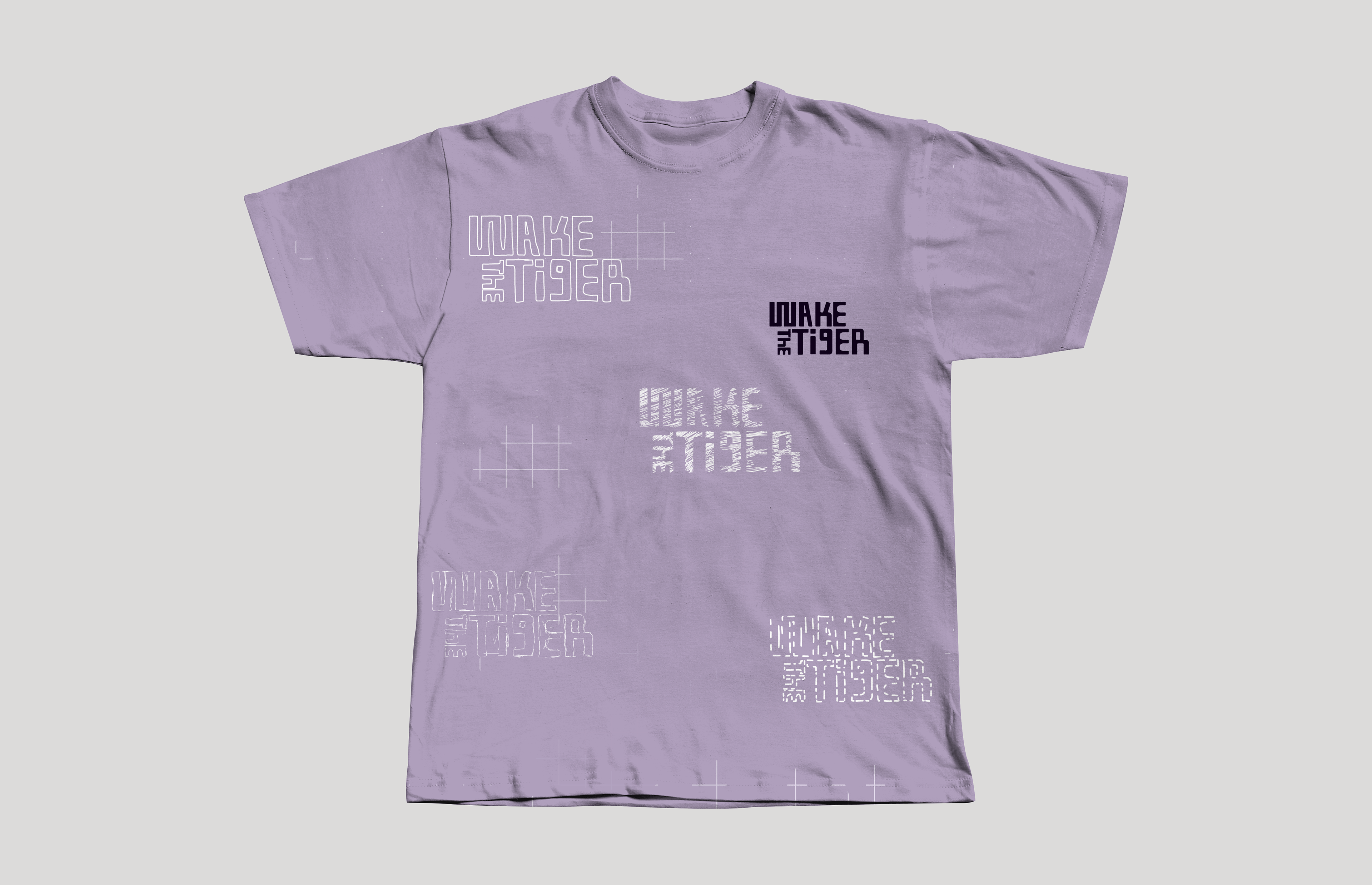
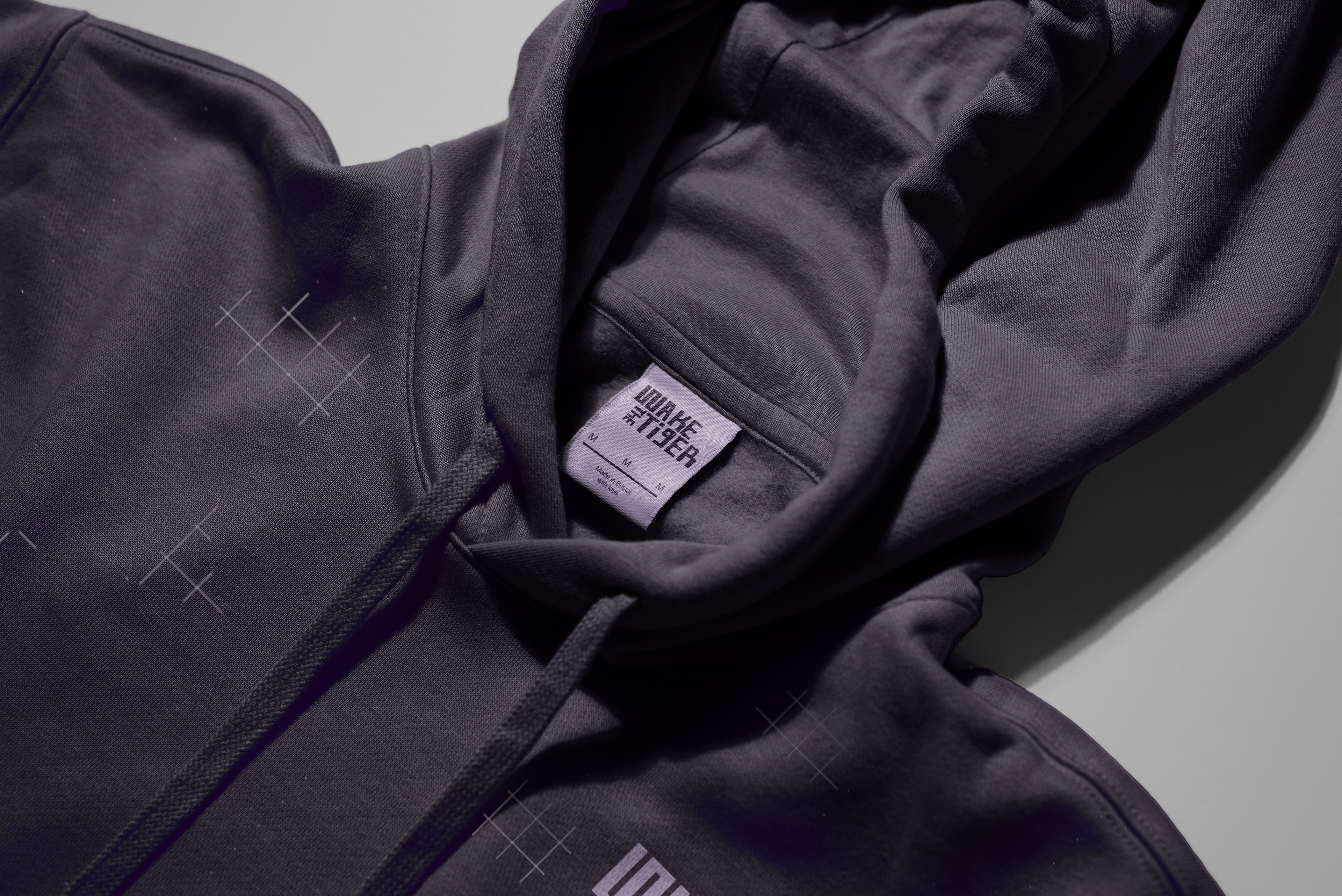
STAFF UNIFORM