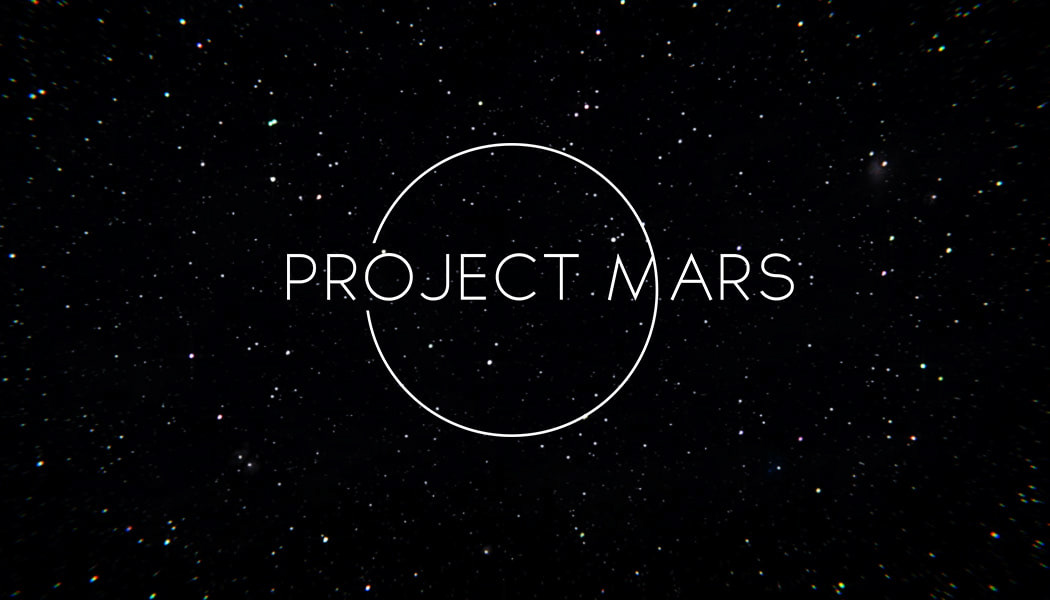
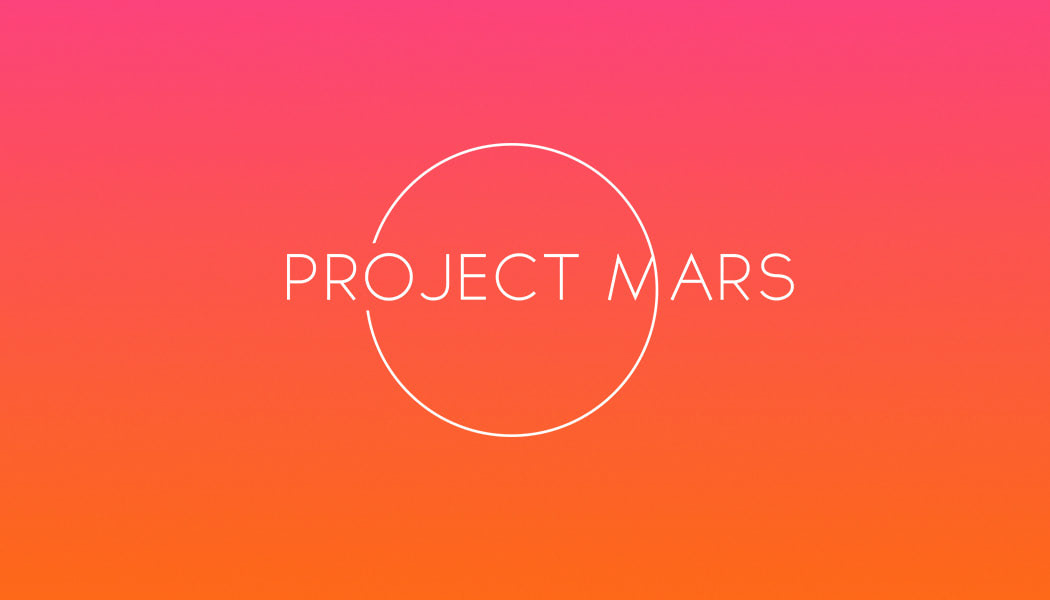
LOGO DESIGN
The rationale behind the logo design was to create something minimal, that represents the futuristic theme of the company. This was created through the use of thin, clean lines and a fine san-serif typeface that matched. The circular shape to the logo hinted as to the nature of the concept, and provided a consistency that could be applied throughout the branding.
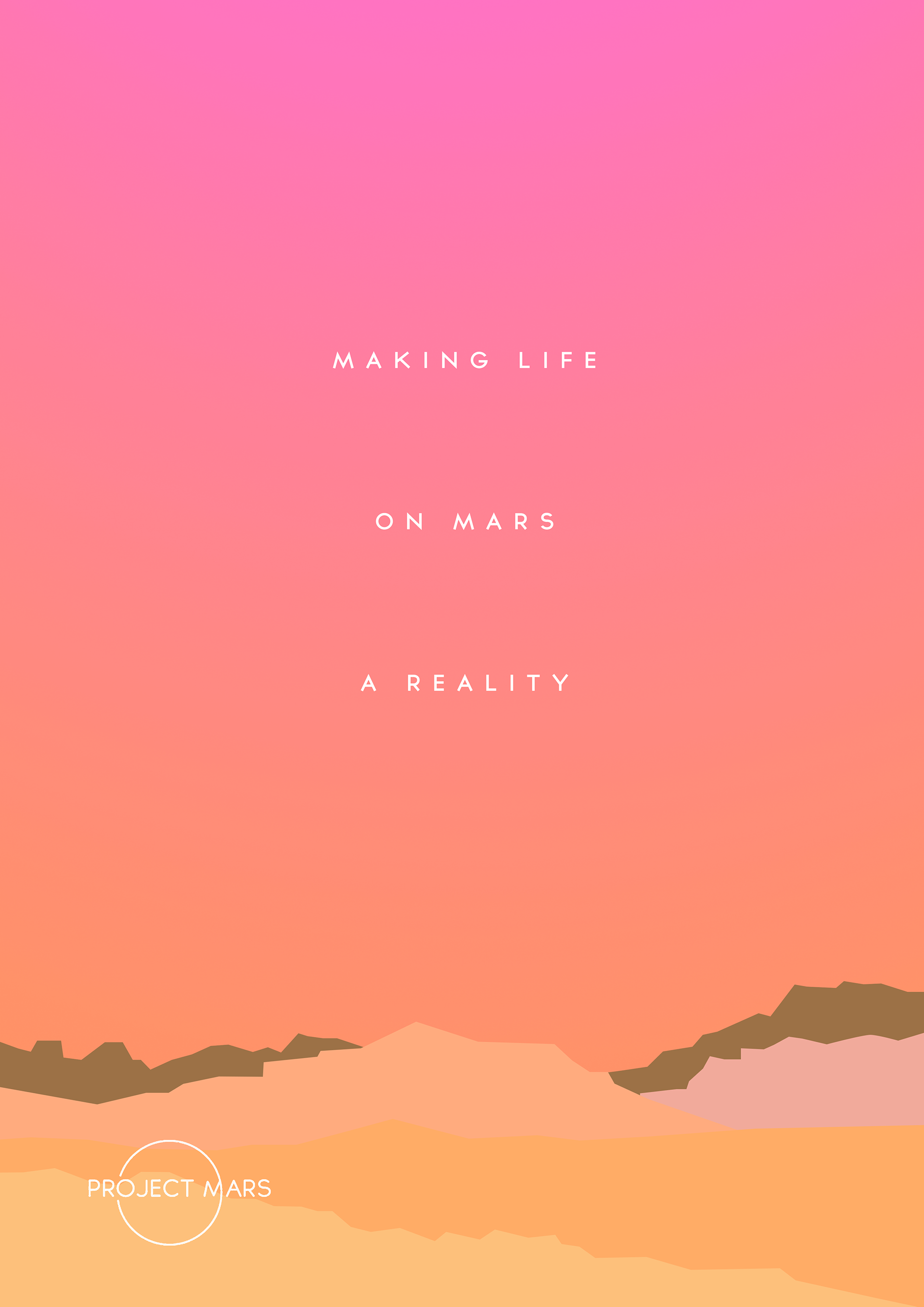
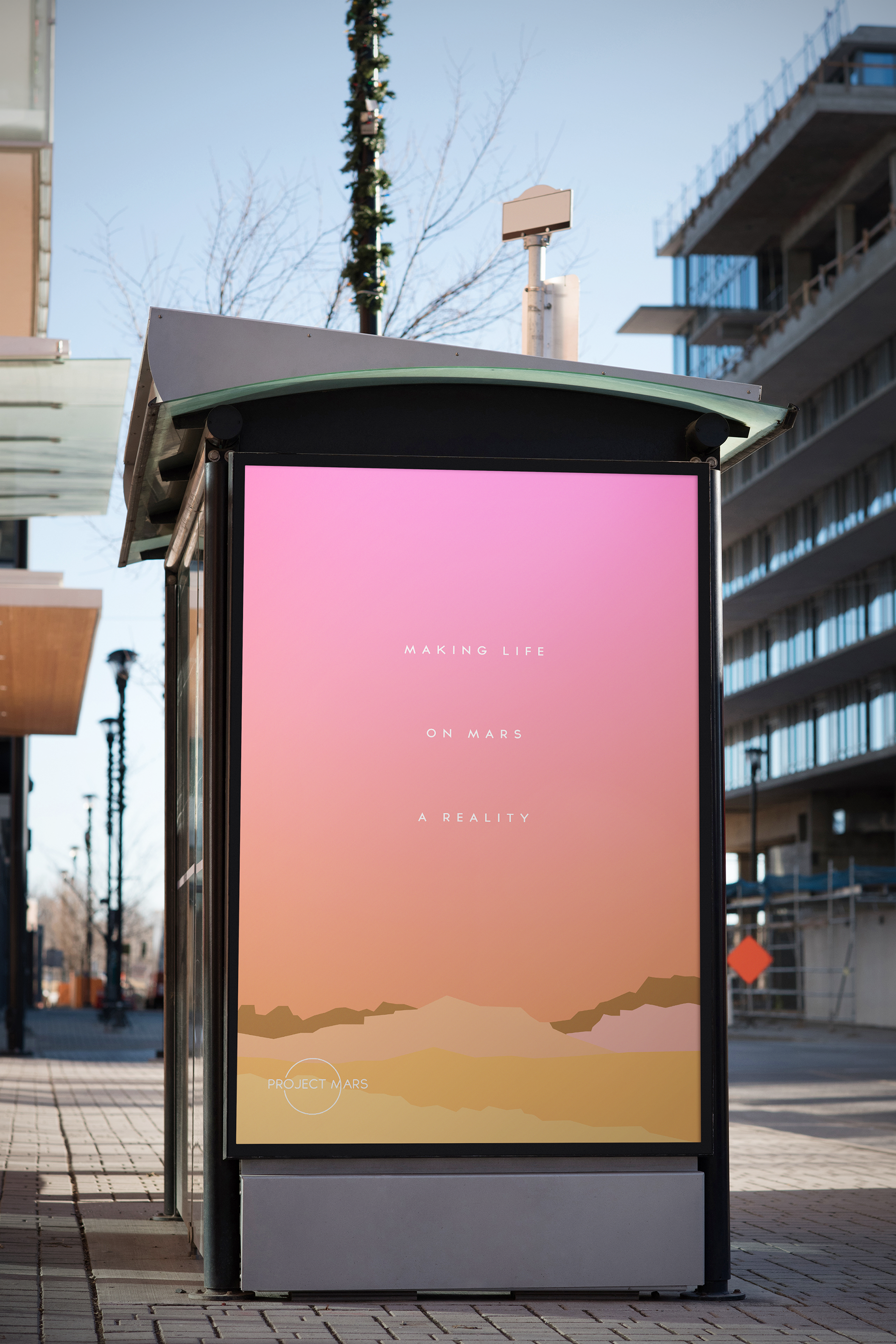
PROMOTIONAL POSTER DESIGN
The minimal, 2D, flat-landscape design and positive use of open space, combined with this text; gives the concept and modern, futuristic feel. The rocky terrain gives insight into what the harsh and barren land may look like. It has a slight contrast against the sky, which emulates a warm, coloured glow.