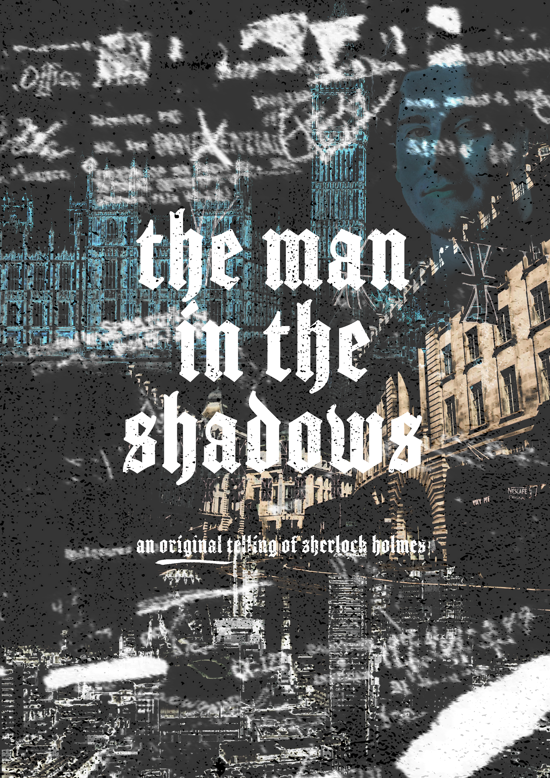
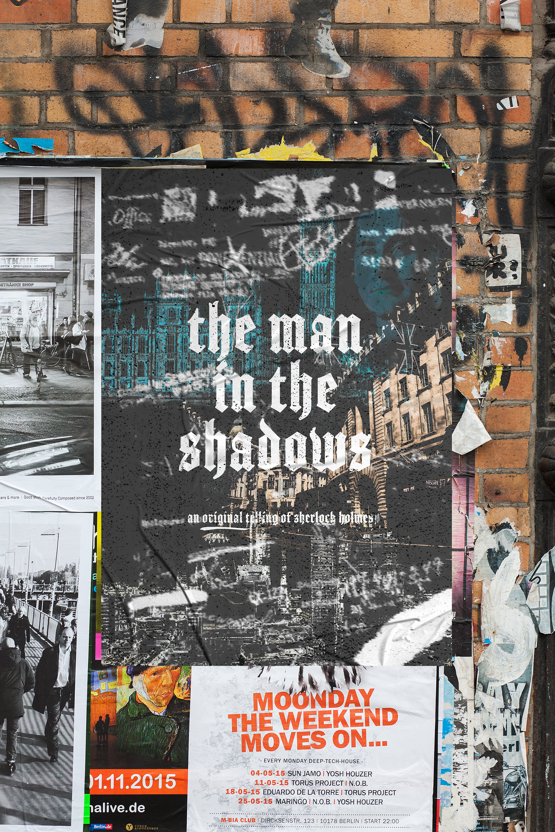
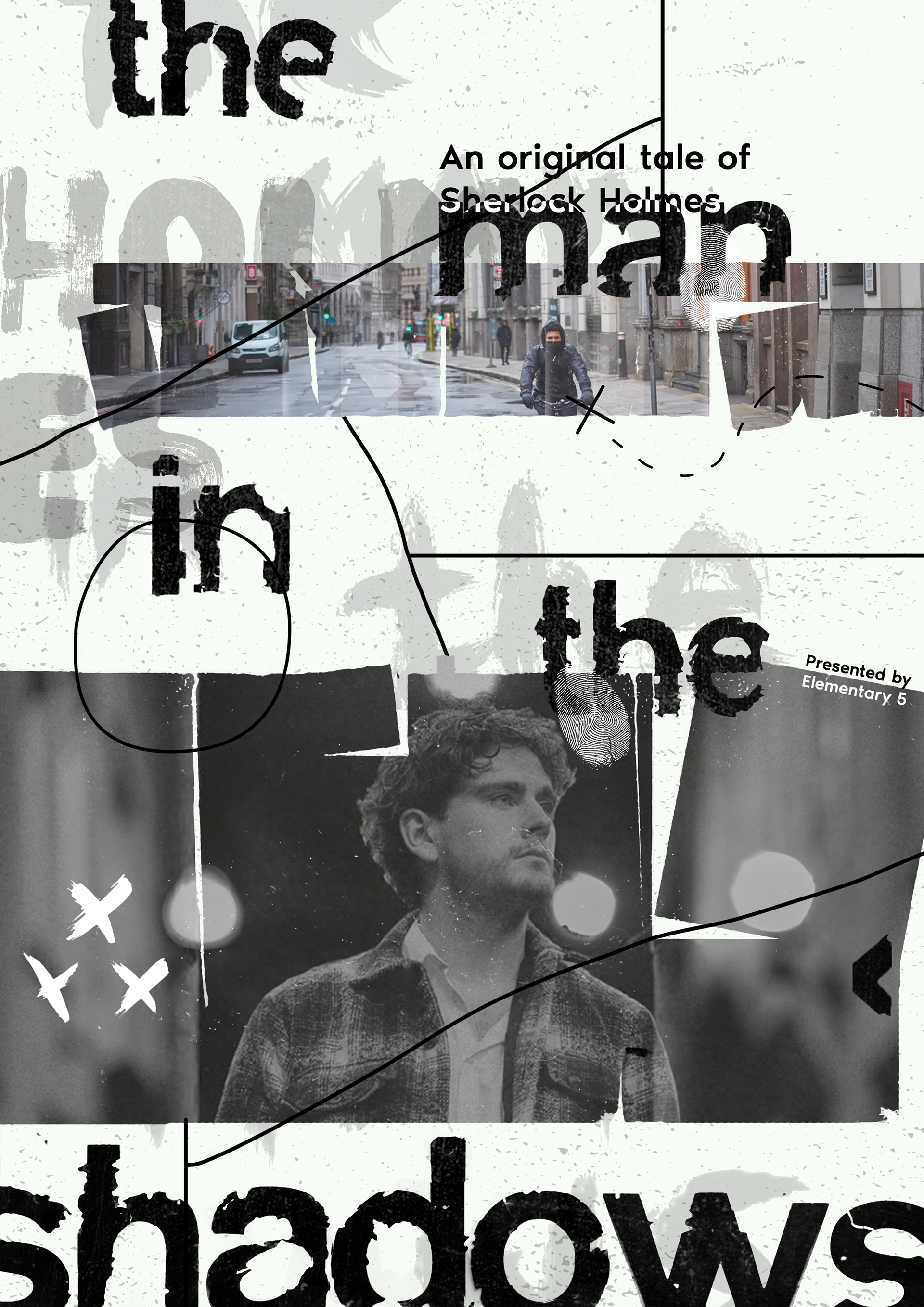
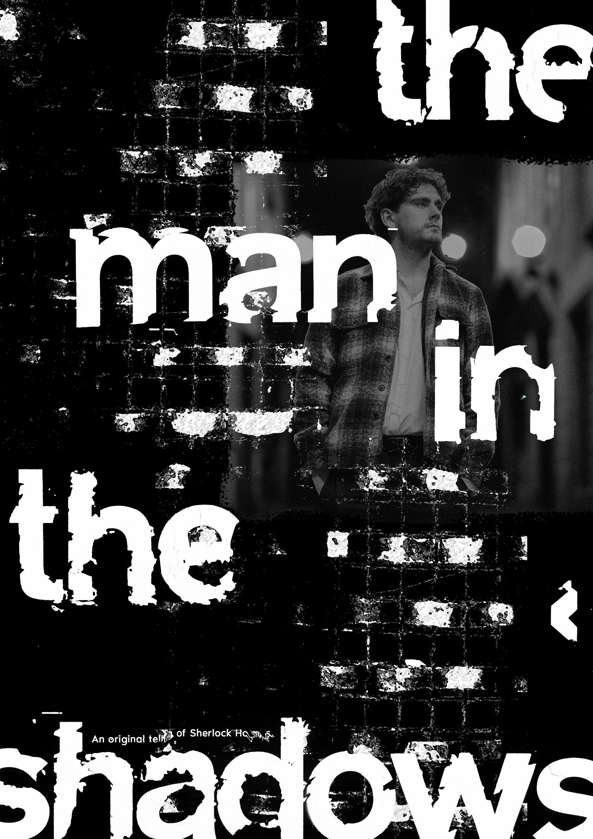
The intention was to create a look with a gritty aesthetic that represented not just the theme of the play, but also the setting of modern London. Using a blackletter typeface seemed almost synonymous with the Sherlock Holmes genre, and contrasted the gritty style well.
POSTER DESIGN
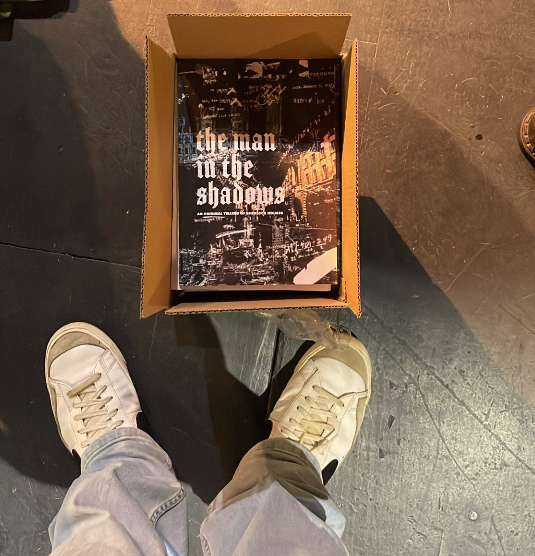
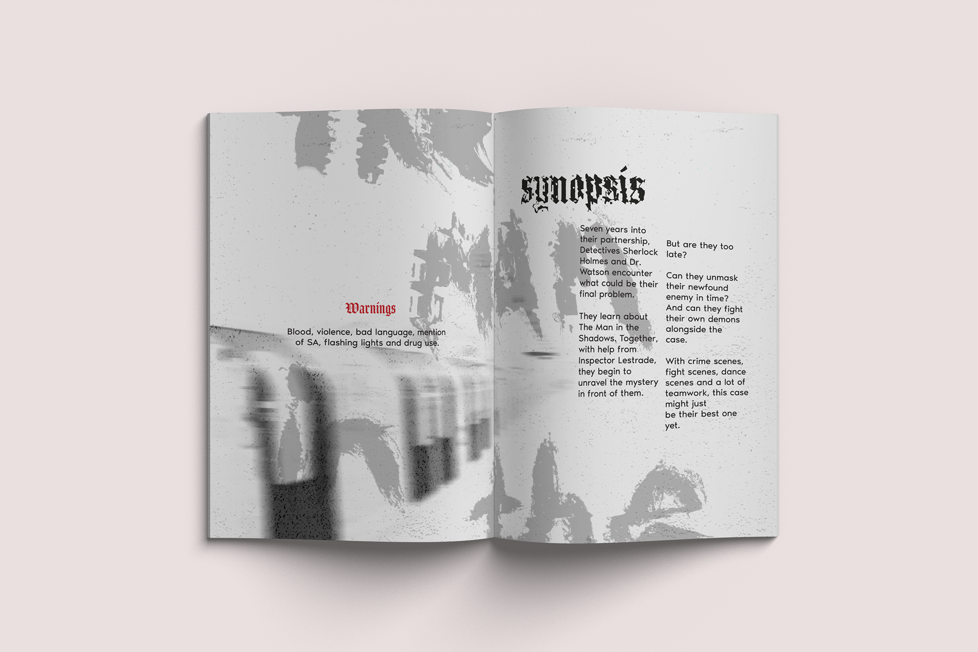
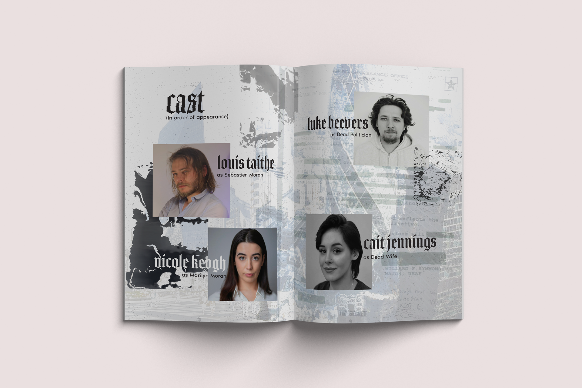
PLAY PROGRAMME
DIGITAL PLAY PROGRAMME
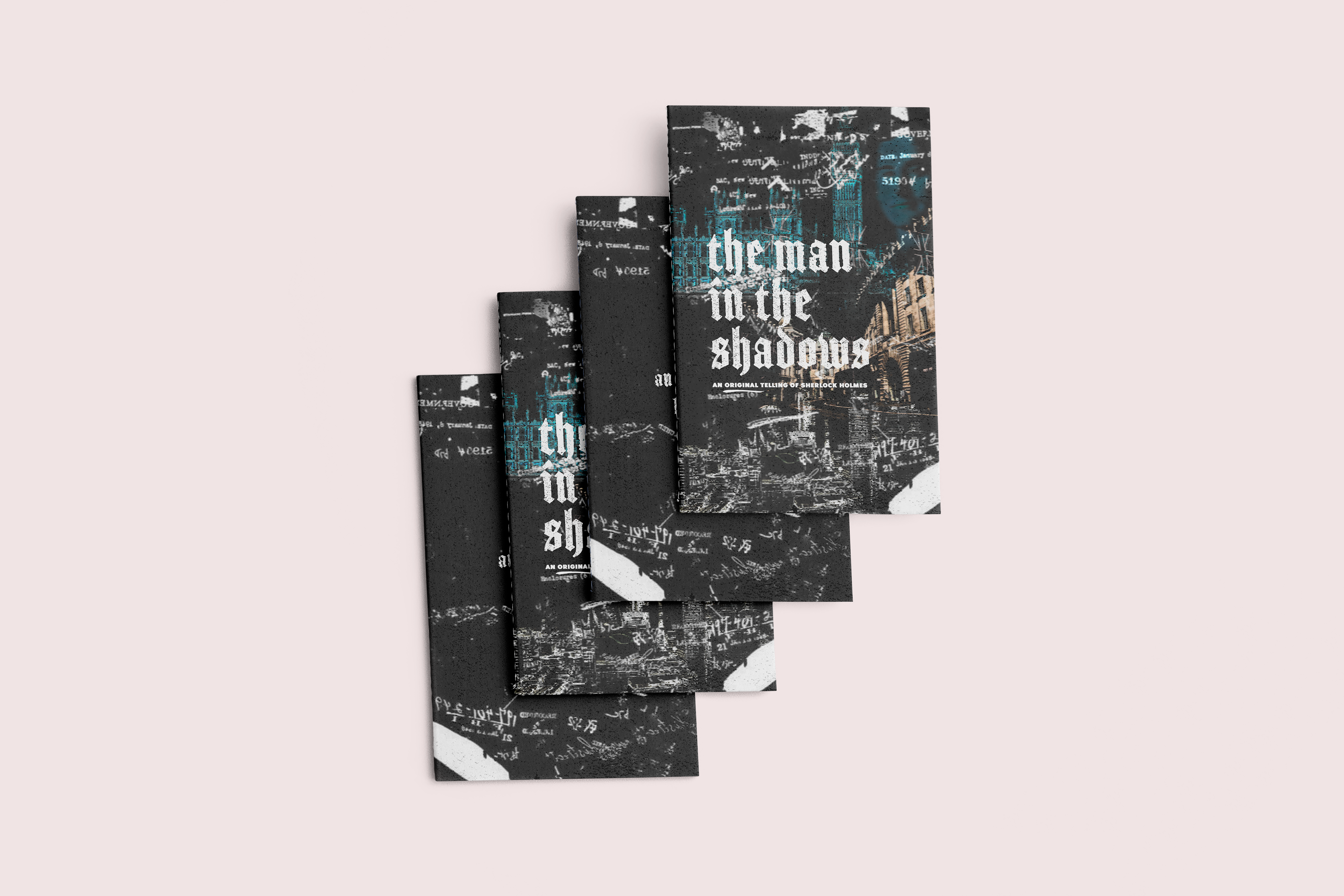
PROGRAM COVER VARIATIONS
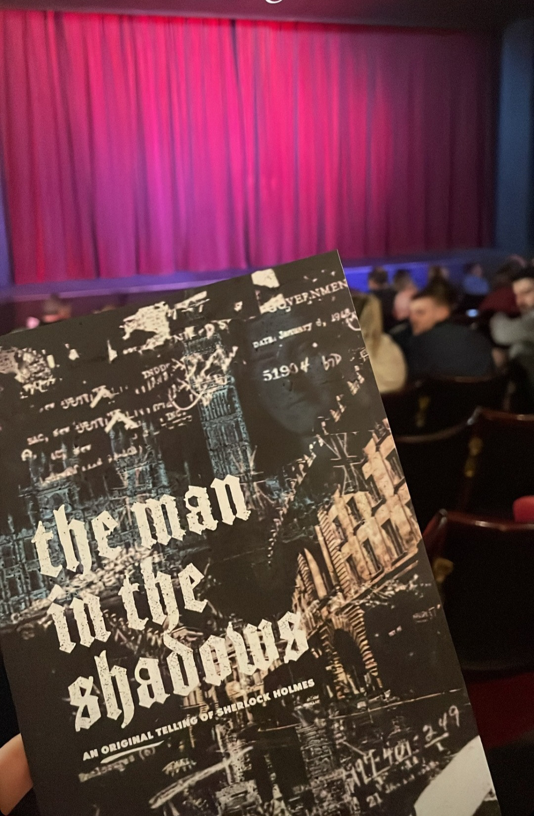
PROGRAMME IN ACTION